On this page
Real-time plot
The real-time plot draws the numbers a device prints as live curves. Tuning a motor's PID loop, calibrating a sensor or checking an ADC for noise, you see the trend, the overshoot and the spike at a glance, instead of reading them off scrolling text. Firmware that already talks to VOFA+ or the Arduino Serial Plotter needs no change.
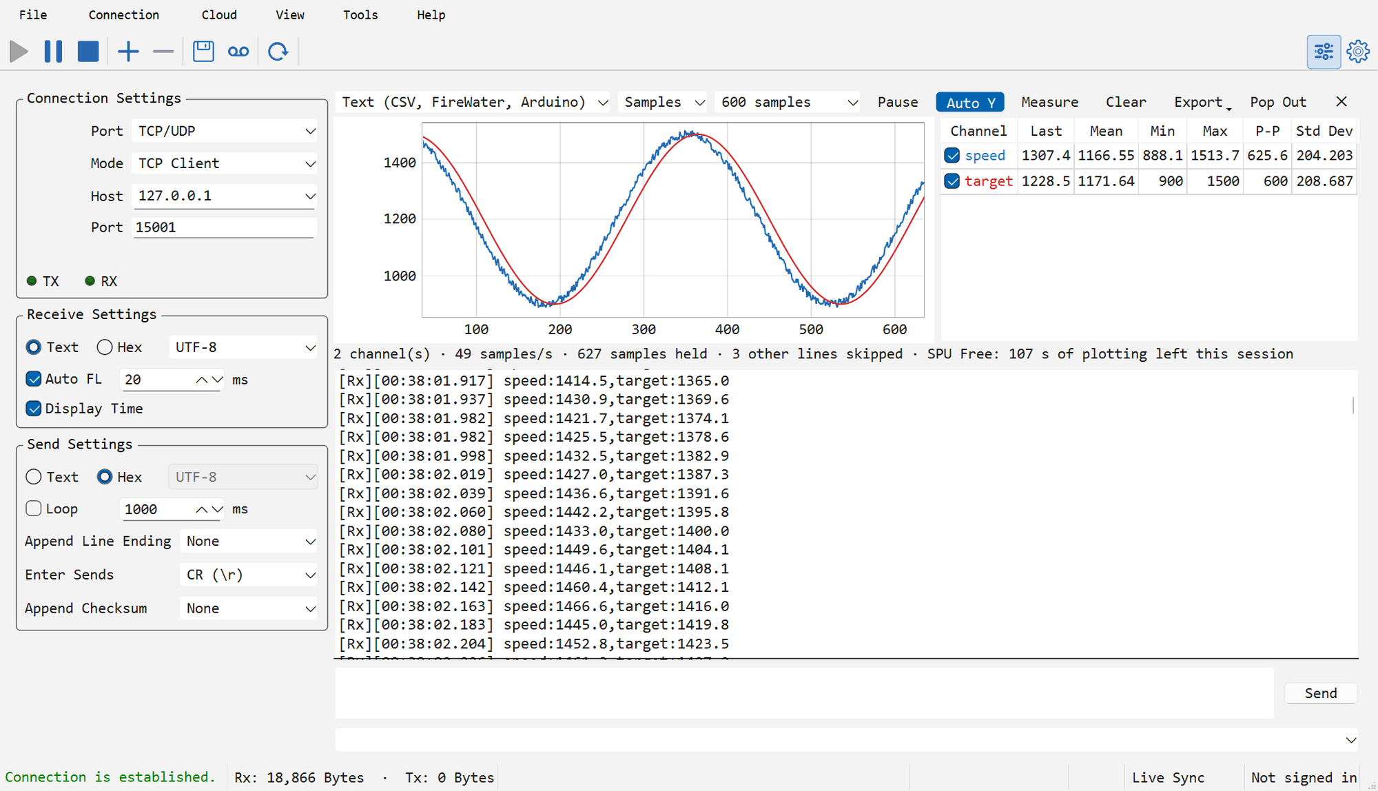
Every connection has its own plot, above its receive view, so the text under the curves is still there to explain a glitch in them. To open it:
- Tools → Plot switches the plot of the focused connection on or off;
- Plot in the receive view's right-click menu does the same for that connection;
- ✕ at the right end of the plot's toolbar closes it.
The plot reads the bytes as they arrive, whether the receive view shows text or hex and even while it is paused. It only works while it is open: numbers that arrived before you opened it are not drawn, and a closed plot costs nothing.
Sending numbers from the device
Choose how the device sends its numbers in the first box of the plot's toolbar.
Text (CSV, FireWater, Arduino) is the default and fits almost any firmware that can printf. Print one line per sample, the numbers separated by commas, spaces, tabs or semicolons, ending in \n, \r or \r\n:
| The device prints | What the plot does |
|---|---|
1.5,-0.2,3 or 1.5 -0.2 3 |
Three channels, named CH1, CH2 and CH3 |
temp:23.5,hum:45.2,pres:1013.2 |
Three channels named temp, hum and pres (the Arduino Serial Plotter style; spaces around the colon are fine) |
pid:100.0,98.6,2.1 |
VOFA+ FireWater: the single label in front names the line, not a channel, so this is three channels CH1 to CH3 |
Motor started or 12:30:45 boot ok |
Not a sample: skipped as ordinary log text |
So an STM32 speed loop can print printf("%.2f,%.2f,%.2f\r\n", target, speed, pwm); and an Arduino sketch Serial.print("temp:"); Serial.print(t); Serial.print(",hum:"); Serial.println(h);. Log messages can go to the same port: any line with something that is not a number in it is left out of the plot. With labels, each label becomes a channel the first time it appears, a line may leave some out (the curve has a gap there), and a line that mixes labelled and bare numbers, such as a:1,2,b:3, is skipped rather than guessed at. A clock such as 12:30 is not taken for a label.
JustFloat (VOFA+) is for firmware that sends raw binary: one little-endian 32-bit float per channel, and each frame closed by the four bytes 00 00 80 7F. It costs the MCU no formatting time, which matters at a few kHz:
float frame[3] = {angle, speed, current};
static const uint8_t tail[4] = {0x00, 0x00, 0x80, 0x7F};
HAL_UART_Transmit(&huart1, (uint8_t *)frame, sizeof frame, 10);
HAL_UART_Transmit(&huart1, tail, sizeof tail, 10);
The plot finds the frame boundary by itself when it joins a stream midway or after lost bytes; the first frame after a connection opens is used for that and not drawn.
Regex is for output you cannot change, such as T=23.5C H=45%. Type a regular expression in the box that appears next to the format:
- each capture group is a channel, and a named group names it:
T=(?<T>[-\d.]+).*H=(?<H>[-\d.]+)gives channels T and H; - without groups, every match in the line is a channel:
-?\d+\.?\d*plots every number on the line.
An invalid expression turns red, and its tool tip says what is wrong.
Changing the format clears the plot, since the old samples say nothing about the new stream. A plot takes up to 32 channels.
Reading the curves
- Horizontal axis: Samples counts samples, which is exact for firmware that prints at a fixed rate whatever the cable does to timing, and matches VOFA+ and the Arduino plotter. Time shows seconds since the plot started, from when the data arrived; since a serial port delivers data in batches, samples that arrive together are spread evenly over the interval.
- How much is in view: the next box offers 100 to 50,000 samples, or 1 to 300 seconds on the time axis, and All. The mouse wheel over the plot zooms the same span in and out.
- Vertical axis: with Auto Y on, the range follows what is in view. Ctrl + wheel sets a fixed range around the pointer, and switching Auto Y off keeps the range on screen.
- Pause freezes the view while samples keep being recorded. Dragging the plot pans back through the history and pauses too. A double click goes back to live with Auto Y.
- Hovering over the plot shows every channel's value at that sample or time.
- Clear forgets every sample. A new connection keeps them, so a device that resets and reconnects continues the same curves.
- Pop Out moves the plot into a window of its own, titled with the connection's name, to put on a second screen; closing that window puts the plot back above the receive view.
The line under the plot counts channels, samples per second and samples held, and "N other lines skipped" (or "bad frames skipped" for JustFloat). The plot keeps the most recent 100,000 samples of each connection; older ones drop off the front. Even with tens of thousands of samples in view the drawing stays smooth, and a one-sample spike is never thinned away.
Channels and statistics
The table to the right of the plot is its legend and a statistics table at the same time. For each channel it shows Last, Mean, Min, Max, P-P (peak to peak) and Std Dev, calculated over the samples in view. Zoom or pause on a stretch of the curve and the numbers describe just that stretch: the mean of a sensor held at a reference point, the noise of an idle ADC channel as its standard deviation, the ripple of a supply as its peak-to-peak.
- Untick a channel to hide its curve; tick it to bring it back.
- Double-click a name to rename it, for example CH2 to
speed_rpm. Clearing the name brings back the one from the stream.
Measuring with cursors
Turn on Measure and click the plot to place cursor A, then cursor B; later clicks move the nearer cursor, and a right-click clears both. A readout shows the position of each cursor and, for every visible channel, its value at A and B and the difference. On the Time axis it also shows the time between them and 1/Δt in Hz, which reads the period and frequency of an oscillation or a step response's rise time straight off the curve.
Saving and sharing
- Export → Export CSV... saves every sample the plot holds, with a sample number, the arrival time in seconds and one column per channel under its name. The file is UTF-8 with a byte-order mark, so Excel shows channel names in any language correctly.
- Export → Save Image... saves the plot as it is on screen as a PNG, for a report or a chat message.
- The plot's settings are saved per connection with the
.spuproject: whether it is open, the format and expression, the axis, the span, the vertical range, channel names and hidden channels. With no project open, the first connection's plot settings are kept on this computer. The samples themselves are not saved; export a CSV to keep a run.
A replay window can plot a recording too: Plot is in each port's View menu and its right-click menu there, and the curves follow the recording's own timing at any replay speed.
Free and SPU Pro
In Free, the plot is there to show that it works with your device:
- the first 2 channels are drawn; the others are parsed and listed in the table, marked Pro;
- 120 seconds of plotting per session, shared by every connection and counted again after SPU restarts; plotting in a replay window is not counted. Only seconds in which new samples arrive count, so a plot left open on an idle port uses nothing. The line under the plot shows the seconds left; when they run out, the plots stop on their last frame and stay readable until SPU restarts;
- Save Image is free; Export CSV and Measure need SPU Pro.
SPU Pro has none of these limits, and activating it lifts them at once, without a restart.